GOOD Magazine is a good magazine and they have great infographics. and now they have them all in one place to ogle! there is a lot of variety in the material and the presentation, but they definitely maintain a unique style. nyt infographics, look out!
ps I think infographics are only going to get more and more ubiquitous as time goes on. maybe I said that before. I'll say it again too
from somewhere on this tech site. i forgot where though

I like this collection of election maps. as per usual, NYT has the best infographics in town. another I like is this one by Mark Newman, who went into more detail. helps show the standard pattern of cities=democrat. he also has some good proportionally based maps.
oh, I know it pretty much goes without saying, but what a grand outcome! It is so strange to have anything but negative feelings toward American politics. it feels funny, but I think I like it.
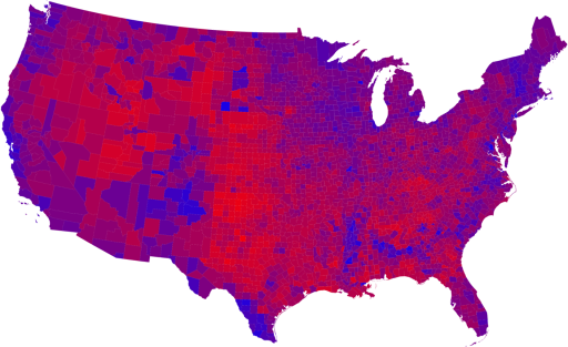
need to see it big
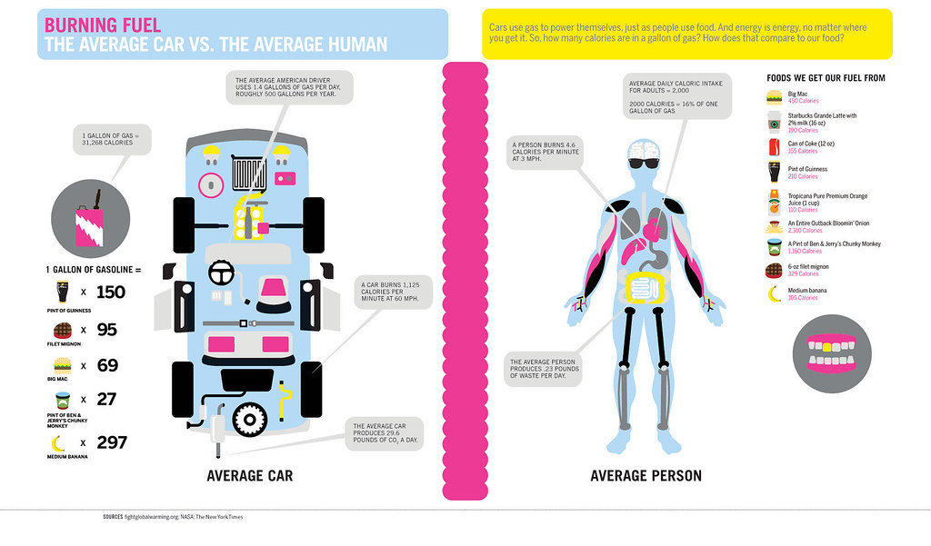
my favorite on the bad side: I Just Pooped

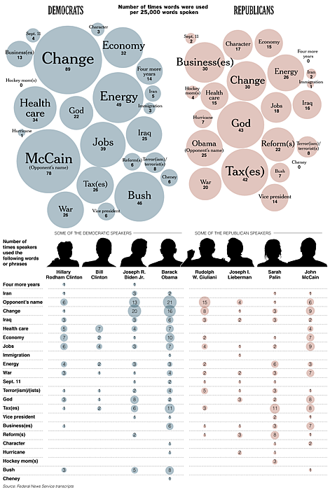
who said what at the party conventions. Apparently the democrats were bigger on keywords overall, which I find mildly surprising. However, the breakdown of what words were said is not. NYT infographics will never be beat.
love this.
graphic chart showing body part mentions per musical genre. czech it.
I went here years ago. It was completely awesome for so many reasons.


Another interesting element in government agricultural subsidies. Also, I love infographics. Link and Story

