so the past little while has been a complete heather-byron fest. friday and saturday hangouts. We played earth hour scrabble on saturday. Byron said we couldn't open the fridge because the light would turn on, but I wasn't willing to wait half an hour for a fresh beer so he held the little light lever down while I grabbed the brews. Sunday there was finally a break from a flat grey sky, so Byron and I sat in the inner harbour sketching. street benches: not just for retired folk and the homeless! Just as we sat down a biker went flying off of his bike right in front of us. It totally ruined the story Byron was in the middle of telling.
knowing my loving of office organization products they showed up on saturday with this awesome gift for me:
The picture doesn't quite do it justice but it is fake wood grain tin. love it! And it still had the original files in it! I just love classic 50s-60s fonts. The ink on my thumb is from yet another leaky pen.
and yesterday they stopped by with the most amazing bouquet of flowers (dad dead for 4 years as of yesterday)
I just love flowers
Then we ate perogies and watched the Dumb and Dumber dvd (6 minutes of deleted scenes, oh my!). just lovely
"Wingdings has a history of controversy. In 1992, only days after the release of Windows 3.1, it was discovered that the character sequence "NYC" in Wingdings was rendered as a skull and crossbones symbol, Star of David, and thumbs up gesture (NYC). This could be interpreted as a message of approval of killing Jews, especially those from New York City. Microsoft strongly denied this was intentional, and insisted that the final arrangement of the glyphs in the font was largely random. (The character sequence "NYC" in the later-released Webdings font, in turn, is rendered as eye, heart, and city skyline, which could be interpreted as "I Love New York City". Microsoft has stated that this is intentional.)"
-Wingdings wiki page

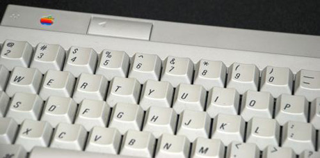

So after watching the new CBC series 'JPod' I decided I'd rather read the book on which it is based before watching anymore. I finally cracked open my unread copy and have barely put it down since. Line I read today that I really liked:
“Documents are thirty four percent more boring when presented in the courier font.”
For me, courier is singly redeemed by my favorite ever prof who used it in all his handouts. His age indicates that he uses it as a carry over from typewriter days. His classic stylings (he really confirmed old man chic for me) made it just so perfect.
Anyway, after reading that line, I saw this. Basically:
The typeface you use for an academic paper might just influence your mark. At the very least, Academics like serifs. My Vista word default is sans serif, I should do something about that!
Since I am already revealing my nerdiness for typography (sounds so much more legit than 'fonts'), I might as well bring up the fact that I like trying to match fonts to people. Maybe I should make it a formal project. hm. oh, ideas!
